Image courtesy of Scryfall.com
Tracing the Frames: From Early Impressions to Modern MTG Design
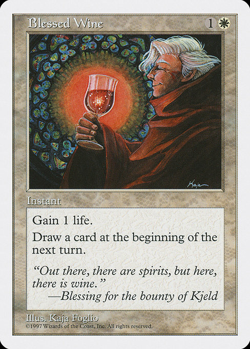
Blessed Wine is a small, shimmering example of how Magic’s frame and color language have grown over the years. This white-mordered instant from Fifth Edition—one of the classic reprint-heavy core sets released in 1997—packs a humble but elegant two-part effect: you gain 1 life and you draw a card at the beginning of the next turn’s upkeep. It’s not flashy, but it embodies a design philosophy that many players still honor: tempo, engine, and a touch of flavorful storytelling in a single moment 🧙♂️🔥. The card’s simple, clean lines sit inside a white-bordered frame that marks a distinct era in MTG’s visual evolution, a period when text boxes, mana cost, and flavor text started to feel more integrated, less cluttered, and more legible at a glance 🎨.
Frame evolution is a tale of contrast and continuity. Early printings experimented with bold art, compact text, and typography that sometimes strained under the weight of new mechanics. As the game evolved through the 1990s and into the 2000s, Wizards of the Coast refined the template—broadening the art space, standardizing mana symbols, and tuning the readability of card text. Blessed Wine, with its modest mana commitment of {1}{W} and a two-part outcome (life gain plus a delayed card draw), exemplifies the era’s emphasis on clear, functional design. It’s a card you can read and know exactly what it does within a breath, a trait that helps a player build memorable plays without wrowning over the fine print 🧙♂️.
Beyond the frame, the card’s rarity ties into a broader nostalgia: rare or common? Blessed Wine is listed as common in Fifth Edition, a time when core sets were a steady pipeline of dependable, affordable cards that could slot into a wide range of strategies. The two-step effect—instant speed surprise life gain and a future card draw—also mirrors the era’s preference for straightforward, reliable interactions. Today, as people collect and compare reprints, Blessed Wine remains a touchstone for discussing how low-cost, high-utility spells helped shape early aggro-control metas and casual archetypes alike ⚔️💎.
“Out there, there are spirits, but here, there is wine.” —Blessing for the bounty of Kjeld
That flavor text, tucked under the card’s white frame, is more than flavor—it's a window into the world of Kjeld, one of the placeholders for mythic-tinged tavern lore that filled Fifth Edition’s pages. The art by Kaja Foglio leans into that mood with a quiet elegance, a reminder that even the smallest spell can carry weight in a world where life and knowledge are precious resources. The card’s art crop and border treatment—subtle, restrained, almost pastoral—serve as a counterpoint to flashier, more bombastic designs of later blocks. It’s a reminder that the Magic Multiverse is a museum of silhouettes and stories as much as a battlefield of numbers 🧙♂️🎨.
What Blessed Wine reveals about frame design and playstyle
- Color and frame language: The white border of Fifth Edition signals a period in which readability and subtlety took center stage. Blessed Wine’s white frame, paired with a modest mana cost, invites players to consider tempo and card advantage in a format where life gain isn’t always a highlight—but in the right context, it saves games.
- Economy of mana: With a mana cost of {1}{W}, the card is accessible in early turns, enabling life gain without delaying other crucial plays. The two-part effect is a textbook example of how Instant-speed spells can create life-sustainment while nudging card advantage forward—two features modern frames still respect.
- Rarity and reprint rhythm: As a common from a core set, Blessed Wine exemplifies Wizards’ approach to broad distribution—cards that are easy to pick up, easy to teach new players, and easy to slot into a variety of casual lists. This accessibility is a thread that runs through many reprint strategies, influencing how modern frame designers balance power and practicality.
- Flavor as architecture: The flavor text and illustrative identity anchor the card in Kjeld’s mythic taverns—an evocative reminder that frame evolution isn’t only about borders and fonts; it’s about a shared sense of place and story across generations of players 🧙♂️.
For modern readers, Blessed Wine also demonstrates how the game’s visual language supports strategic thinking. The instant-speed effect invites flashy combat tricks or life-gain lifelines at crucial moments, while the delayed card draw can seed an engine for the next few turns. It’s a gentle primer for players who want to understand the foundational MTG rhythm: act in the present, plan for the next turn, and always keep an eye on your life total as a resource both in and out of combat 🔥.
Design echoes in today’s frames
As MTG moved toward newer templates—bolder typography, larger artwork, and refined symbol placement—the core idea remained intact: a card’s frame should serve the card’s function, not obscure it. Blessed Wine stands as a living postcard from the white-border era: a reminder of simplicity, reliability, and the art of balancing life with knowledge. If you’re curating a collection or drafting a nostalgia-heavy cube, this little instant is a perfect touchstone for talking about how card frames have grown up while maintaining the heart of the game 💎⚔️.
And if you’re part of the modern viewing or collecting crowd, the crossover between vintage aesthetics and contemporary play is part of the thrill. Blessed Wine shows that even a modest spell can carry weight with the right frame, the right text, and the right moment in the game. It’s the magic of design—where color, layout, and flavor meet a playable moment on the battlefield 🧙♂️🎲.
While you ponder the elegance of lines and margins, you can keep the real world at your side with a handy gadget: the Phone Click-On Grip Back-of-Phone Stand Holder. A simple companion for daily life, it pairs nicely with the calm, measured vibe of classic MTG frames—two small joys in one day. Check it out here:
Phone Click-On Grip Back-of-Phone Stand Holder
More from our network
- Fan Art Tributes and Reinterpretations of Yorvo, Lord of Garenbrig
- Two Kiloparsecs Away: A Hot Star Tests Cluster Membership
- Luxury in Simplicity: Customizable Desk Mouse Pad with One-Sided Print
- Meteorite Easter Eggs: Hidden Design Jokes for MTG Fans
- Spectrox Mines: Set-by-Set Power Scaling Across MTG Sets