Image courtesy of Scryfall.com
Typography and layout analysis: Ertai's Familiar in the Weatherlight era
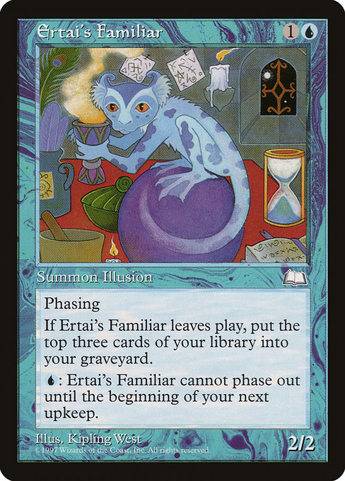
Blue has always loved the art of timing in Magic: the Gathering, and Ertai’s Familiar—an unassuming 2/2 Illusion with a very specific trick—offers a treasure trove for anyone who loves how a card’s typography and frame whisper (or shout) its mechanics. Released in the Weatherlight set, this rare from the late 1990s marries a clean, legible text block with a frame that was still feeling its way toward the modern MTG aesthetic. The result is a card that reads like a compact lecture on how type, spacing, and keyword placement guide a player’s eye as much as a spell guides a duel. 🧙♂️🔥
From the outset, the mana cost—{1}{U}—sits in the upper-right corner, immediately signaling blue’s traditional emphasis on tempo and trickery. The small but precise mana iconography contrasts with the larger body text, creating a rhythm: a quick cost cue, then a longer line of rules text. The card’s name—Ertai’s Familiar—takes prominence at the top, set in a bold type that anchors the identity of the card even as the frame keeps the eye scanning downward toward the rules. This layout reflects a typographic principle you’ll see across MTG: the name and mana cost establish hierarchy, while the body text delivers the narrative and rules. 📜
“The art of reading a card is as much about the spaces between words as the words themselves.”
The frame language of Weatherlight: cadence, contrast, and a hint of nostalgia
The Weatherlight era’s frame feels almost handshake-friendly—familiar enough to ground a player in a beloved era, yet bold enough to stand out on a crowded table. Ertai’s Familiar uses a black border with a slightly darker interior, helping the blue text glow without sacrificing legibility. The type line for the creature’s name is compact, while the creature type line—“Creature — Illusion”—plays a crucial role in setting expectations about gameplay: it’s a fragile, evasive unit whose real power comes from its abilities rather than brute force. The alt-lexicon here matters; the font choices strike a delicate balance between flair and readability, a foundational concern for UI designers who translate the game onto digital canvases or print pages. ⚔️🎨
Speaking of spacing, the card’s line breaks are purposeful. The oracle text—“Phasing (This phases in or out before you untap during each of your untap steps. While it’s phased out, it’s treated as though it doesn’t exist.) When this creature phases out or leaves the battlefield, mill three cards. {U}: Until your next upkeep, this creature can't phase out.”—is segmented to guide you through the rules in bite-sized phrases. That’s not an accident: line-length, margins, and paragraph breaks are cleanly tuned to prevent cognitive overload in the heat of a match. In modern UI, you’d expect similar care—line height tuned for readability, ample whitespace around the rules, and a hue choice that respects color access. 🧙♂️
Typography, color identity, and the cadence of blue spells
Ertai’s Familiar communicates blue’s flavor not just through its effects but through its typographic footprint. The body text length and the generous margins create pacing that mirrors blue’s tempo: you read, you parse, you mill. The “Mill” and “Phasing” keywords sit at the core of the card’s identity, and their presentation—capitalized keyword lines and clear, concise explanations—helps players quickly convert text into tactical decisions. The color identity (Blue) is reflected in the cool, restrained feel of the card’s typography and spacing, a design language that encourages patient, calculated play. 💎
In practice, Ertai’s Familiar asks you to weigh the paradox of its own existence: it phases in and out, a literal non-presence that still exerts influence. The milling trigger—“When this creature phases out or leaves the battlefield, mill three cards”—fits neatly into blue’s archetypal themes: disruption, card advantage, and tempo. The typography helps players understand the timing of that effect, even when the strategy is more theoretical than immediate. The art and frame complement this: a creature that embodies illusion and timing, captured in a style that suggests both caution and curiosity. 🎲
Art, rarity, and the collectability conversation
As a rare from an iconic set, Ertai’s Familiar carries a particular aura: it isn’t the flashiest spell, but it is a living reminder of the Weatherlight era’s design ethos, where danger could be both invisible and inevitable. Kipling West’s illustration—lush with blue tones and a sense of quiet misdirection—pairs with a frame that keeps the viewer’s eye moving from name to text to capabilities, then back to narrative. The card’s nonfoil printings, its vintage frame, and its legacy in formats where phasing still mattered (in some casual or legacy contexts) all contribute to its collector appeal. And yes, the quirky flavor of a mill-and-illusion combo still sparks nostalgia in players who cut their teeth on the loopy corners of 1990s MTG. 🧙♂️💎
From table to tablet: applying a classic layout to modern experiences
What can modern designers learn from Ertai’s Familiar when crafting digital card interfaces, compendiums, or tabletop aids? First, a strong typographic hierarchy matters: name, cost, type, and rules text each have distinct roles, and their sizes, weights, and spacing should reflect those roles. Second, the frame’s silhouette should guide a viewer’s eye toward the rules that matter most in a moment—tempo cards like this one reward clear, instantly legible text. Third, color identity isn’t just about art; it informs contrast decisions that ensure readability across devices and lighting conditions. And finally, the “feel” of a card—its art, its frame, its rhythm—can evoke memory and emotion, turning a quick search for a card into a mini trip back to a beloved night of drafting or a memorable rare pull. ⚔️🎨
Whether you’re organizing a desk display, curating a digital MTG library, or simply admiring the craft, Ertai’s Familiar stands as a compact case study in how typography and layout support a card’s story. And if you’re looking to merge that appreciation into everyday accessories, consider checking out a stylish, sturdy phone grip—a practical canvas for tabletop aesthetics and a subtle nod to the kinds of design choices that make a card feel timeless. 🔥🧙♂️
Phone Click-On Grip Durable Polycarbonate KickstandMore from our network
- https://example.com/wiki/post/pokemon-tcg-stats-muk-card-id-bw9-46/
- https://blog.digital-vault.xyz/blog/post/essential-logo-design-principles-for-digital-startups/
- https://blog.rusty-articles.xyz/blog/post/hidden-value-of-well-made-phone-cases-neon-magsafe-case-with-card-holder/
- https://blog.crypto-articles.xyz/blog/post/nft-data-pechi-225-from-pechi-nft-collection-on-magiceden/
- https://blog.digital-vault.xyz/blog/post/tangle-asp-in-commander-top-deck-frequency-insights/

Ertai's Familiar
Phasing (This phases in or out before you untap during each of your untap steps. While it's phased out, it's treated as though it doesn't exist.)
When this creature phases out or leaves the battlefield, mill three cards.
{U}: Until your next upkeep, this creature can't phase out.
ID: 354c9de7-0cdf-4302-9d1a-ae17eca13053
Oracle ID: 711cd80d-c58d-4c2a-87db-d2e4c75f60d3
Multiverse IDs: 4484
TCGPlayer ID: 6020
Cardmarket ID: 8606
Colors: U
Color Identity: U
Keywords: Mill, Phasing
Rarity: Rare
Released: 1997-06-09
Artist: Kipling West
Frame: 1997
Border: black
EDHRec Rank: 26205
Set: Weatherlight (wth)
Collector #: 38
Legalities
- Standard — not_legal
- Future — not_legal
- Historic — not_legal
- Timeless — not_legal
- Gladiator — not_legal
- Pioneer — not_legal
- Modern — not_legal
- Legacy — legal
- Pauper — not_legal
- Vintage — legal
- Penny — not_legal
- Commander — legal
- Oathbreaker — legal
- Standardbrawl — not_legal
- Brawl — not_legal
- Alchemy — not_legal
- Paupercommander — not_legal
- Duel — legal
- Oldschool — not_legal
- Premodern — legal
- Predh — legal
Prices
- USD: 0.70
- EUR: 0.88
- TIX: 0.03
More from our network
- https://crypto-acolytes.xyz/blog/post/nft-stats-gorbagio-12-from-gorbagio-collection/
- https://example.com/wiki/post/pokemon-tcg-stats-lanas-aid-card-id-sv06-207/
- https://blog.digital-vault.xyz/blog/post/how-to-manage-cross-functional-collaboration-effectively/
- https://blog.crypto-articles.xyz/blog/post/nft-data-a-degen-day-001-from-mythic-labs-collection-on-magiceden/
- https://example.com/wiki/post/pokemon-tcg-stats-oshawott-card-id-swsh4-33/