Art Direction in the Wasteland Fallout 76 Visual Reimagination
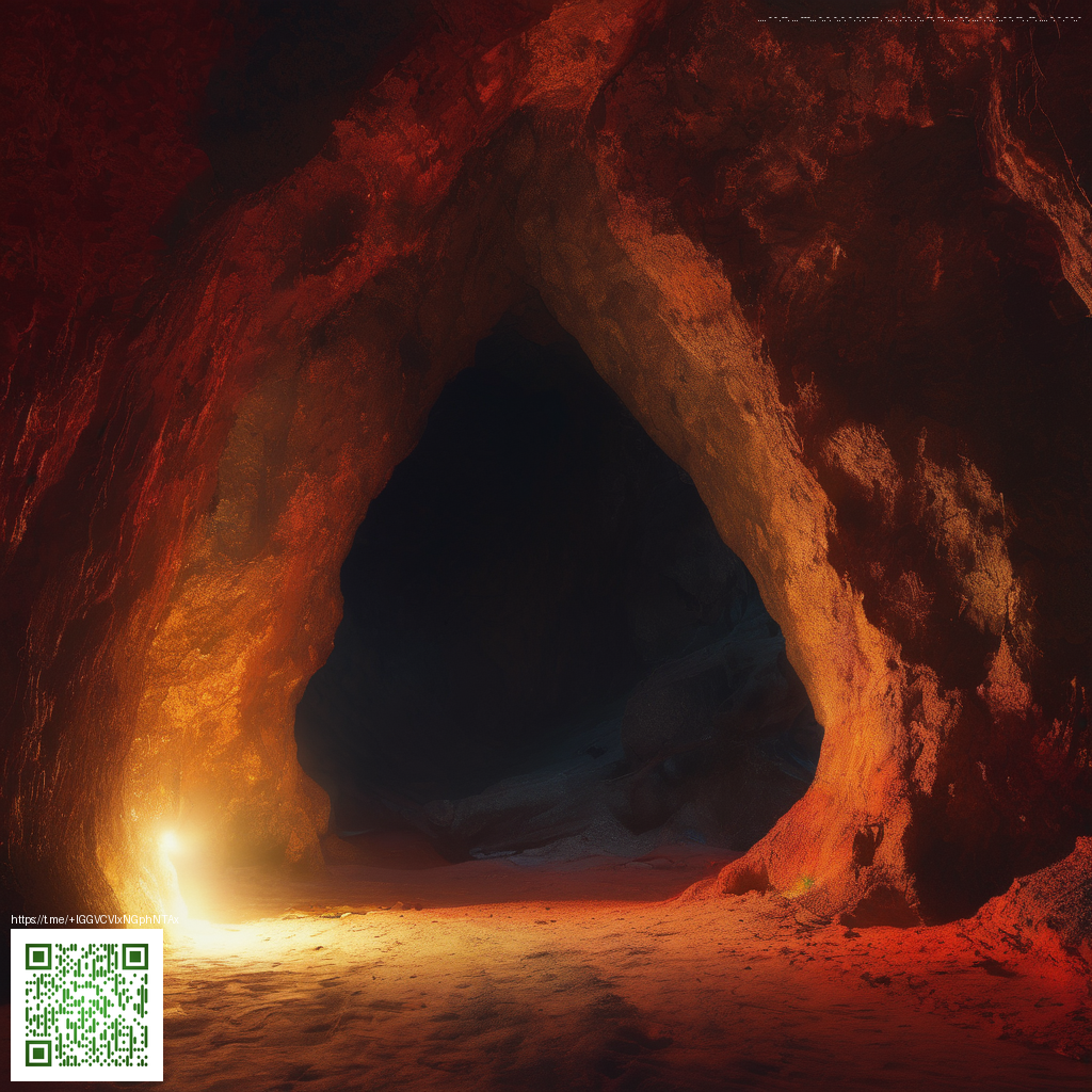
The look of Fallout 76 has shifted from bold neon hints to a more tactile and grounded wasteland. This evolution matters far beyond aesthetics. Visual choices in texture, lighting, and structure shape how players explore, engage enemies, and experience the world at large. The latest direction leans into material realism and environmental storytelling, inviting players to decipher the ruin through color, contrast, and atmosphere rather than through flashy spectacle alone.
At its core, the new visual language aims to support gameplay. Color becomes a reading tool for danger and opportunity, while lighting guides your eye toward points of interest in cluttered ruins. Ruined factories, weathered signage, and rusted vehicles are not merely backdrops; they cue players to hidden rooms, resource caches, and possible threats. This approach makes exploration feel intentional, rewarding players who pay attention to how light bends across a shattered skyline.
Visual language that shapes play
- Color and mood lean toward earthy, desaturated tones with selective saturations to highlight critical objects or enemies.
- Lighting choreography uses volumetric fog and bounce light to create depth in rubble heaps, making silhouettes easier to read at a glance.
- Texture and material fidelity emphasize weathering such as corrosion, grit, and peeling paint, reinforcing a sense of real places that have stood the test of a long, harsh winter.
- Architecture and layout prioritize believable zoning and settlements that feel lived in, with modular pieces forming convincing camps and outposts.
- Clarity for combat art choices balance camouflage and exposure so players can spot threats during chaotic firefights without losing immersion.
Community members have noted how this refined palette improves readability during tense encounters, while still delivering the signature Fallout vibe. The trade off between cinematic color and practical visibility becomes a discussion point in streams, guides, and forums, where players debate which hues best serve stealth, sniping, or close quarters brawls. The result is a shared language that helps new players quickly orient themselves in a sprawling, dangerous world.
Updates and the art evolution cadence
Updates and expansions have consistently refined the look and feel of the wasteland. Each major patch brings subtle shifts to lighting, weather effects, and texture density, aligning the visuals with evolving gameplay systems. The goal is not merely to polish a static image but to support dynamic experiences such as settlement building, faction clashes, and cooperative exploration. The development team has stressed that tone and atmosphere drive the visuals as much as fidelity, ensuring the world remains cohesive as content expands.
As the game shifted through several large free updates and paid expansions, the visual upgrade also reflected changes in NPC behavior, settlement density, and environmental hazards. The day night cycle feels more expressive when combined with improved volumetric lighting, while weather patterns augment the sense of danger during patrols. This interplay between update-driven changes and core art direction keeps the wasteland feeling alive, even as players revisit familiar ruins with new tools and goals.
Modding culture and community experimentation
Modders have embraced the art direction shift with gusto. Retextures, shader tweaks, and color grading mods allow players to tailor the atmosphere to their tastes while preserving the core design language. Some communities pursue a grittier, grayer wasteland tone for realism, whereas others lean into a slightly warmer or more stylized palette to capture a specific mood. This experimentation demonstrates how art direction can become a living conversation between developers and players, with mods extending the game’s lifespan and creative potential.
Beyond visuals alone, mods often tweak how textures read during combat and exploration. Players report that even small changes, such as enhancing surface roughness or adjusting ambient occlusion, can dramatically alter how enemy silhouettes appear at a distance or how readable a distant doorway becomes in poor weather. The culture of repair and enhancement mirrors the game world itself, where persistence and adaptation are part of the journey.
Developer commentary and the tonal intent
In official posts and interviews, the art team has described a deliberate shift toward a grounded tone that serves narrative clarity and gameplay readability. The aim is to evoke post apocalyptic grit without sacrificing legibility in busy combat spaces. This philosophy guides decisions from how buildings crumble to where light falls at dawn. It also informs how environmental storytelling supports quest lines, faction dynamics, and exploration rewards, ensuring the world feels coherent as new chapters arrive.
What stands out is a collaborative cadence between art direction, level design, and combat tuning. The result is a wasteland that not only looks right but feels right when you step through a ruined door into a corridor of chance, danger, and discovery. Gamers who value a sense of place will notice how color cues and lighting choices keep the world immersive without pulling them out of the action.
For players who prioritize gear and performance, the update cadence offers a practical boon as well. Visual clarity often translates to smoother decision making during encounters and better situational awareness during exploration. The art direction thus becomes a strategic asset as much as a stylistic choice, confirming that a thoughtful visual language can elevate core gameplay.
Now you can bring a small piece of that tactile focus to your desk as you dive into the wasteland. If you are looking to enhance your desk setup while you game, consider this premium mouse pad option designed for steady control and comfort during marathon sessions.
Custom Rectangular Mouse Pad 9.3x7.8in Non-Slip Desk Mat