Image courtesy of Scryfall.com
Leonin Arbiter and the Evolution of MTG Illustration
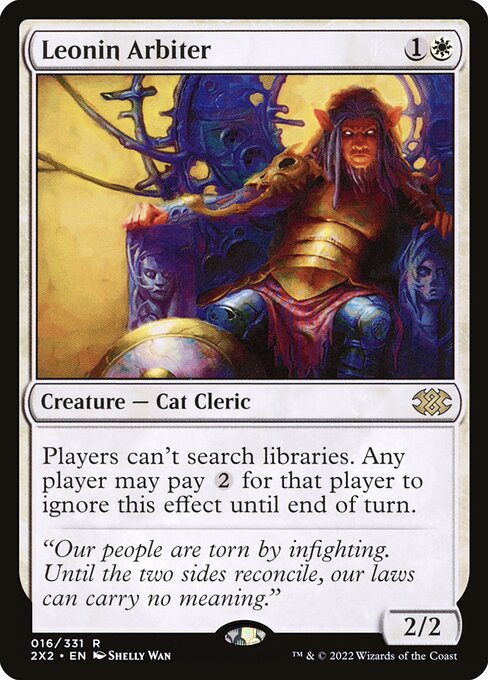
In the current wave of Magic: The Gathering art, we’re seeing a thoughtful blend of painterly nuance and digital polish that invites players to linger on the board and in the lore. Leonin Arbiter, a white creature—Cat Cleric, to be precise—is a perfect case study. Debuting in Double Masters 2022, a set known for its glossy presentations and premium reprints, the card’s imagery communicates more than just a stat line. The 2/2 creature for {1}{W} carries a flavor that hints at ritual discipline and lawful order, and Shelly Wan’s illustration approach helps that flavor land with a confident, almost ceremonial glow 🧙♂️🔥. The piece radiates a calm authority while surrounding the Arbiter with emblematic light—an aesthetic choice that mirrors the set’s premium feel and the white mage’s foreground role in many archetypes.
From a design perspective, this era of MTG art leans toward strong silhouettes, clean linework, and striking color contrast. The Arbiter’s white frame and the crispness of its features align with a broader trend toward legibility on crowded boards, where players must quickly parse who’s doing what under the pressure of a clock and a sea of tokens ⚔️🎨. Yet the art doesn’t forsake texture; there’s a tactile sense of cloth, fur, and even the shimmer of magical warding that invites a second or third glance. In the Double Masters 2022 printing, the high-resolution scan treatment emphasizes those details, making a rare card feel almost tangible when you tilt it under the light. It’s a testament to how modern illustration can honor tradition while embracing the punchy, vibrant language of contemporary card photography and digital rendering 🧪💎.
“Our people are torn by infighting. Until the two sides reconcile, our laws can carry no meaning.”
The flavor text on Leonin Arbiter anchors the card in a moral debate that resonates beyond the kitchen table. The Arbiter’s presence is more than a stat block—it's a narrative posture: a keeper of procedure, a reluctant mediator, and a symbol of order in a game that rewards both tempo and patience. This melding of law-and-order storytelling with cat-like nobility reflects a broader trend in MTG illustration where character-centric art carries a philosophy-forward bite. In practice, players aren’t just reading a line of text; they’re absorbing a stance on how truth is adjudicated in the face of chaos, a theme that’s comfortable for veterans who remember older cycles and exciting for newcomers drawn to the cinematic artistry of our multiverse 🧙♂️⚖️.
What this card reveals about current illustration trends
- Cinematic lighting meets painterly texture: The art leans into luminous highlights and carefully modulated shadows, creating a sense of depth that reads well at a glance but rewards slow study. This mirrors how contemporary MTG art aims for an “in-frame” moment that can still pay homage to traditional fantasy illustration.
- Character as arbiter of lore: Leonin Arbiter embodies a role—judge and enforcer—that mirrors how the game uses flavor to justify powerful mechanics. The visual vocabulary reinforces the card’s function (and the tension of library disruption) without needing a paragraph of rules text to explain it.
- Color identity as narrative tool: White’s clean lines and bright aura serve as a visual cue for order, law, and guardianship. This color-driven storytelling is increasingly common in modern releases, helping players immediately place a card’s tone even before reading the mana cost.
- Premium print aesthetics in reprints: Double Masters 2022’s treatment—foil possibilities, high-res scans, and careful border choices—emphasizes collectability while preserving legibility on crowded boards. Even a classic archetype like Arbiter benefits from a refresh in the modern printing era 🧲🔥.
For collectors, the card’s status as a rare from a Masters set adds to its mystique. Available in both foil and nonfoil versions, Leonin Arbiter’s look communicates a narrative of lawkeeping and restraint—a perfect contrast to the more explosive monster-art that dominates some sets. The rarity, combined with Shelly Wan’s approach, makes this piece feel contemporary yet timeless, a combination that’s at the heart of why fans chase modern reprints as they chase new mechanics. And while the game’s rules thread may be a touch clinical, the art invites a broader conversation about how illustration evolves as MTG’s world expands, grows more diverse, and invites players to see themselves as part of the unfolding story 🎲💎.
As you craft decks, you’ll notice how such imagery informs a player’s mood: the card suggests restraint, patience, and strategic enforcement—qualities that pair nicely with control and prison-style themes in Modern. The Arbiter’s ability—“Players can't search libraries. Any player may pay {2} for that player to ignore this effect until end of turn”—is a literal nod to the idea of access being restricted and negotiated. In practice, this can swing tempo and resource management in ways that feel both tangible and thematic at the table. The art, in its quiet majesty, reinforces the sense that laws—whether printed on a card or inscribed in a community—shape the very pace and drama of matchups 🧙♂️🪄.
For players who want to elevate their setup beyond the game, a focused desk space can make a big difference. If you’re chasing that vibe of modern MTG illustration—where art, lore, and competitive play collide—a clean, stylish desk mat can be the perfect companion. The Neon Custom Desk Mouse Pad (rectangular, 3mm thick, rubber base) from the shop linked below is a playful nod to the same neon energy that animates many contemporary card frames. It’s an unobtrusive way to keep cards, accessories, and thoughts organized as you plan your next big play 🖥️🎨.
Whether you’re chasing nostalgia, digging into the lore of new mechanics, or simply admiring the visual evolution of a single card, Leonin Arbiter stands as a bridge between eras. The piece captures the moment when MTG art moved from purely fantastical illustration to a richer, more cinematic storytelling medium—one that feels at home on a modern board, a high-res monitor, or a glossy collector’s sleeve. The trend lines are clear: sharper presentation, stronger narrative cues, and a willingness to celebrate traditional fantasy while embracing the digital future. And that balance—that delicate equilibrium between old-school charm and new-school polish—is what makes MTG illustration so endlessly fascinating 🧙♂️🔥💎.
Product Spotlight: If you’re curating a desk that nods to the current vibe of MTG illustration, consider adding the Neon Custom Desk Mouse Pad from Digital Vault. It’s a compact, stylish companion for late-night deckbuilding and casual kitchen-table brawls alike. Explore the product here:
neon-custom-desk-mouse-pad-rectangular-3mm-thick-rubber-base
More from our network
- https://transparent-paper.shop/blog/post/nostalgia-fuels-collector-demand-for-my-laughter-echoes/
- https://crypto-acolytes.xyz/blog/post/how-kitsune-loreweaver-transforms-token-decks/
- https://crypto-acolytes.xyz/blog/post/parallax-fades-for-a-hot-blue-giant-in-capricornus/
- https://blog.digital-vault.xyz/blog/post/insufferable-balladeer-sparks-nostalgia-for-forgotten-mtg-novels/
- https://articles.zero-static.xyz/blog/post/overwatch-2-cosplay-highlights-that-dominate-the-scene/