Image courtesy of Scryfall.com
Aligning Overload's Art with Invasion's Visual Identity
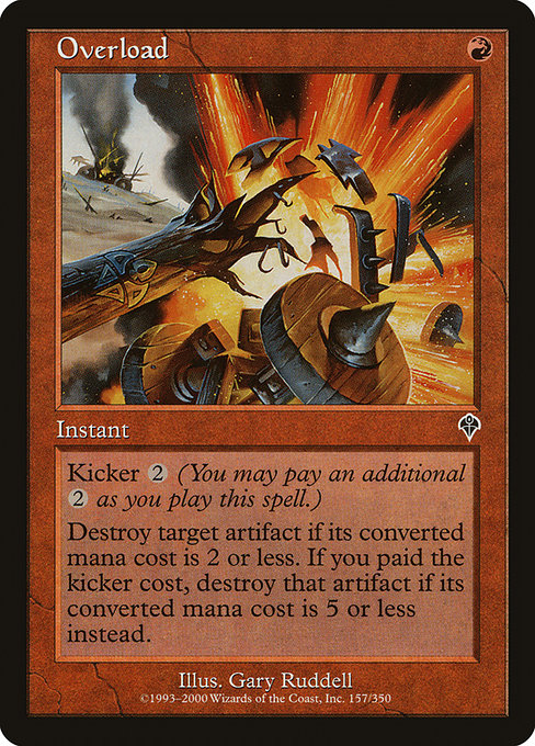
When you open a card from the Invasion block, you’re stepping into a world that feels large, kinetic, and alive with conflict. The instant Overload, with its mono-red frame and cost of a single red mana, proves that red need not be verbose to be ferocious. The illustration—crafted by Gary Ruddell—channels red’s signature temperament: speed, urgency, and a willingness to push raw force through a moment of intense disruption. The image serves as a visual shorthand for the spell’s effect: a targeted blast that you can magnify with a well-timed kicker. 🔥
The art’s composition leans into dynamic diagonals and a blaze of energy that seems to leap off the page. That sense of motion mirrors the mechanic itself: you pay extra to tilt the balance, destroying an artifact that might otherwise weather a standard play. Invasion’s design language embraces that sense of chaos tempered by structure—the set’s artifacts are both thematic targets and narrative elements—so Overload slotting into this visual world feels earned, not forced. The red glow surrounding the energy bolt also nods to red’s dominance in high-tempo plays, where momentum matters as much as the artifact you’re removing. 💎⚔️
“Red spells blaze with speed, and a well-timed kicker makes that blaze burn even brighter.” 🧙♂️
From a design perspective, Overload demonstrates a tidy alignment between aesthetic and function. The card’s mana cost is deliberately simple, which makes the kicker a strategic pivot. If you choose to pay the extra {2}, you’re not just getting more removal—you’re embracing the idea of “overloading” a situation with enough force to erase a more valuable threat (artifact with mana value up to 5). This mirrors Invasion’s broader visual strategy: keep the imagery bold and legible at a glance, while encoding a bit of narrative complexity for those who study the set’s artifacts and multicolor dynamics. The iconic red aura—the heart of the art’s color identity—anchors the card firmly within its home block, even decades after release. 🧪🎨
For modern readers and collectors, this is a reminder that artwork can be a guide to engine-building and tempo in older eras of MTG. Invasion’s art direction favors high-contrast scenes where the consequences of spellcasting are visible in the physics of the moment—the crackling energy, the shattered framework of the artifact, the implied discharge of power. Overload captures that concept with a concentration of energy, a decisive moment, and a crisp, action-forward silhouette that reads clearly across a crowded table. It’s no accident that this card remains a touchstone for red’s aggressive playstyle even as the set’s values continue to echo across new releases. 🔥💥
Visual cues that tie art to set identity
- Color language: A bold red palette that signals tempo and destruction, with orange accents that suggest heat and intensity. 🔥
- Motion and focus: The diagonal energy lines guide the eye toward the artifact, mirroring how the spell targets its foe in a single, decisive moment. ⚡
- Art direction: A painterly, slightly gritty style characteristic of the pre-digital era, aligning with Invasion’s gritty, battlefield-scale storytelling. 🧙♂️
- Mechanics-as-art: Kicker amplifies the spell’s impact in a way that visually reinforces the idea of “overloading” the battlefield with red’s rapid-fire pressure. 💎
For fans who appreciate more than just the card text, Overload offers a compelling case study in how art can illuminate mechanic design. The layering of a straightforward cost with a bifurcated effect—dependent on the kicker—parallels the way Invasion’s visuals often present multiple layers of meaning: a singular clash that also hints at a broader, shifting battlefield. When you pair this with the set’s world-building ethos—artifact-rich environments, aggressive red strategies, and a willingness to punish overextension—the art-to-identity alignment becomes a crisp, teachable moment for new and veteran players alike. 🧭⚔️
Casual collectors might find themselves returning to the original card stock not just for nostalgia but for an appreciation of how a single image anchors a cascade of gameplay ideas. Overload’s rarity—Common in its era—also serves as a reminder that great art doesn’t require rarity to resonate. It’s the clarity of the moment, the decisiveness of the action, and the boldness of the color that stay with you long after you’ve shuffled the deck. And for those who love a little cross-pollination between MTG and the broader world of collectibles, the synergy between a vintage card’s narrative and a sleek modern phone case offer a playful nod to how collectors curate experiences across mediums. 🔄🎲
Clear Silicone Phone Case Slim Durable Open Port DesignMore from our network
- https://crypto-acolytes.xyz/blog/post/the-next-era-of-web3-scalability/
- https://transparent-paper.shop/blog/post/why-creators-should-diversify-digital-marketplaces/
- https://crypto-acolytes.xyz/blog/post/distant-hot-star-confounds-parallax-with-red-hue/
- https://blog.digital-vault.xyz/blog/post/deathgaze-cockatrice-mastering-protection-and-evasion/
- https://crypto-acolytes.xyz/blog/post/why-sandbox-games-elevate-player-creativity/