Image courtesy of Scryfall.com
Typography and Layout in MTG Card Frames
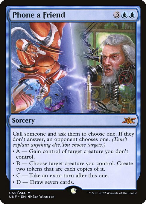
In the tactile world of Magic: The Gathering, typography is more than mere garnish—it's a storytelling tool that guides your eye across fortunes, pacts, and peril. The blue spell at hand, hailing from the playful Unfinity set, is a masterclass in how frame design, font choices, and layout shape the way players read and react to a card’s text. As we explore its lines, you’ll notice how the blue mana cost anchors the color identity, while the long, multi-part oracle text invites careful reading before it whisks you into a cascade of possibilities. 🧙♂️🔥
The card's mana cost, {3}{U}{U}, sits prominently in the upper left, its blue hue signaling not only the color of the spell but the cadence of the words that follow. In blue, the typography leans toward clarity with a slightly condensed feel, ensuring that the costly decision points—who’s chosen, who’s affected, what’s gained—don’t get lost in the swirl of the frame’s carnival-flair. The layout respects the traditional hierarchy: name, mana cost, type line, oracle text, and rarity stamp all march in orderly steps. This is where fans notice the difference between a clean, legible frame and one that fights for space. The Unfinity treatment remains legible while leaning into humor and whimsy. 🎲
Within the oracle text, the card asks you to “Call someone and ask them to choose one. If they don't answer, an opponent chooses one. (Don't explain anything else. You choose targets.)” That parenthetical note is a typography dare: it tucks a disclaimer into the rhythm of the sentence, demanding a line break that preserves readability. The four options, stylized as bullet-like lines beginning with “• A — …” through “• D — …,” create a visual rhythm that mirrors the decision tree the card invites. The font choice must keep these long, clause-heavy lines from feeling like a wall of text. The typography here becomes a small performance—each option stands on its own line, almost like a stage cue, inviting a strategic breath before you commit to a target or a copy of a creature. ⚔️
“A blue spell that asks you to choose targets with others watching the result—typography becomes a dialog between intention and possibility.”
The frame itself—2015-era, black-bordered, with the distinctive security stamp—plays a subtle but perceptible role in readability. Unfinity’s funhouse aesthetic sits atop a familiar frame, so the type remains anchored in recognizable MTG readability while the occasional whimsy nudges the eye to slower, more deliberate reading. The card’s rarity, marked as mythic, contrasts the high-stakes decisions of its effects with a relatively modest market price in casual circles (roughly a few tens of cents in non-foil form on common price trackers). This juxtaposition makes the typography feel like a gateway to a broader playful universe where layout, art, and text work in harmony. 💎
Artistically, Ben Wootten’s illustration meets the frame’s comedic cadence with balance rather than chaos. The art demands attention, but the typography keeps pace, ensuring the reader can parse the choices without missing the nuance of “two tokens that are each copies of it” or the possibility of an extra turn. The color identity is reinforced by the blue text, and even the notation bullets carry a sense of rhythm—one quickly learns to scan for the important verbs, then to savor the flavor text if present in other cards. This is a reminder that MTG’s typographic design is as much about storytelling as it is about rules. 🎨🧭
From a collector’s perspective, the card’s layout and rarity contribute to its charm. The foil and non-foil finishes offer different typographic experiences: foil often makes the text glisten, subtly affecting legibility, especially in lower lighting. Meanwhile, the nonfoil version keeps the type crisp in more traditional reading conditions. The interplay between font weight, line-height, and the spacing around the four options creates a readable map—one that’s as much about how you read under tournament pressure as it is about the card’s theoretical value. For fans who love to study frame-by-frame, this is a small but satisfying case study in how typography can reinforce a card’s mood and mechanics. 🧙♀️
Finally, a note on accessibility. The Unfinity frame, while playful, should not come at the expense of legibility. The card’s blue color, combined with standard MTG typefaces, remains accessible to color-blind readers, and the clear delineation of sections—name, cost, type, and rules—helps everyone parse the card quickly. If you’re designing fan content or custom playmats, you can borrow a lesson here: let the layout lead the eye to the critical decisions first, then welcome the flavor and irony that MTG art so loves to deploy. 🔎
Five design takeaways for typography lovers
- Color as a typographic cue: The blue mana cost instantly signals the card’s identity and pacing.
- Line breaks that respect meaning: The long oracle text benefits from deliberate breaks around the “A — B — C — D” options.
- Frame familiarity with playful details: Unfinity’s frame retains legibility while inviting a grin at the carnival aesthetic.
- Rarity and finish affect readability: Foil vs. non-foil can shift perceived contrast and flow.
- Cultural context in typography: The card’s text design echoes the mindset of a playful, social game—where strategy and conversation collide at the table. 🧙♂️
For readers who want to explore more about how layout and typography influence MTG perception, the network you’re reading today hosts a mix of practical guides and design-focused pieces. The following links provide a window into related conversations—ranging from durable phone accessories to NFT stat tracking—each a reminder that the craft of reading cards is as much about the reader as the text itself. 🔥💎
More from our network
- https://blog.rusty-articles.xyz/blog/post/smart-buying-guide-clear-silicone-phone-case-for-slim-durable-protection/
- https://crypto-acolytes.xyz/blog/post/nft-stats-gorbagio-522-from-gorbagio-collection/
- https://wiki.digital-vault.xyz/wiki/post/pokemon-tcg-stats-hisuian-samurott-vstar-card-id-swsh10-197/
- https://blog.crypto-articles.xyz/blog/post/nft-data-monkey-biz-1760-from-monkey-business-collection-on-magiceden/
- https://crypto-acolytes.xyz/blog/post/nft-stats-dapper-doggos-8-from-dapper-doggos-collection/

Phone a Friend
Call someone and ask them to choose one. If they don't answer, an opponent chooses one. (Don't explain anything else. You choose targets.)
• A — Gain control of target creature you don't control.
• B — Choose target creature you control. Create two tokens that are each copies of it.
• C — Take an extra turn after this one.
• D — Draw seven cards.
ID: da66e33a-3a11-494f-9c23-8e410f7cdae4
Oracle ID: 0fb9ea76-9065-4870-9256-d9fdb88fac85
Multiverse IDs: 580761
TCGPlayer ID: 287026
Cardmarket ID: 676961
Colors: U
Color Identity: U
Keywords:
Rarity: Mythic
Released: 2022-10-07
Artist: Ben Wootten
Frame: 2015
Border: black
EDHRec Rank: 29126
Set: Unfinity (unf)
Collector #: 55
Legalities
- Standard — not_legal
- Future — not_legal
- Historic — not_legal
- Timeless — not_legal
- Gladiator — not_legal
- Pioneer — not_legal
- Modern — not_legal
- Legacy — not_legal
- Pauper — not_legal
- Vintage — not_legal
- Penny — not_legal
- Commander — not_legal
- Oathbreaker — not_legal
- Standardbrawl — not_legal
- Brawl — not_legal
- Alchemy — not_legal
- Paupercommander — not_legal
- Duel — not_legal
- Oldschool — not_legal
- Premodern — not_legal
- Predh — not_legal
Prices
- USD: 0.19
- USD_FOIL: 0.20
- EUR: 0.24
- EUR_FOIL: 0.38
More from our network
- https://x-landing.zero-static.xyz/ee5dfb44.html
- https://blog.digital-vault.xyz/blog/post/scaling-feedback-loops-a-practical-guide-for-teams/
- https://blog.crypto-articles.xyz/blog/post/geodude-sealed-product-trends-in-the-pokemon-tcg-market/
- https://crypto-acolytes.xyz/blog/post/nft-stats-lil-chiller-2585-from-lil-chillers-collection/
- https://blog.crypto-articles.xyz/blog/post/nft-data-planet-kaiju-21-from-planet-kaiju-collection-on-magiceden/